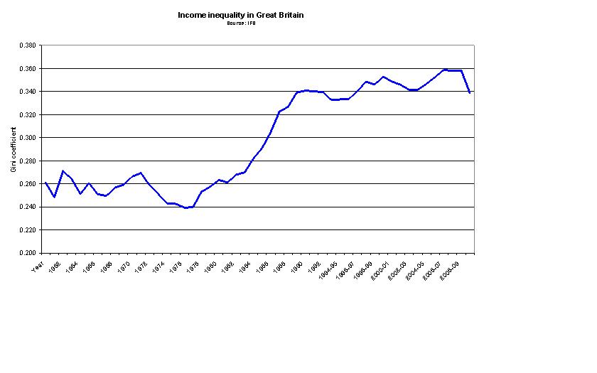
This chart might help inform the debate on income inquality during the years Margaret Thatcher was Prime Minister. It shows the Gini coefficient over time. The higher it is, the higher is income inequality.

We can see that it rose sharply in the early 1980s. This trend was seen throughout industrialised countries at the time so cannot be seen as UK specific. However the debate centres around what measures - if any - were taken to fight it, or whether in fact the Conservative government made little or no effort at all.